Why SimplePark looks different now

In this post
You may have noticed already: SimplePark looks different. The website is calmer, there is more room, and next to our familiar blue you now see a warm orange. It isn't a new coat of paint for the sake of it. It started with a question we asked ourselves: who do we actually want to be?
The story first
We started SimplePark as three students who wanted to share empty driveways. It didn't work. But all those conversations with drivers taught us something. Finding a spot was annoying. Paying for it was worse: an app with a subscription, fees you had to go looking for, and the worry of forgetting to stop.
So we built the parking app we wanted ourselves. A lot has been added since, for companies too. And at some point we noticed that our story no longer quite fit who we had become. So we sat down and took a proper look. What do we want? What do we stand for? And does that fit where we are going in the years ahead?
What we stand for
The answer fits in one sentence: parking should never get in the way of your day. Nobody drives somewhere to park. You go to a meeting, a birthday, a client or the doctor. Parking is the part in between, and it should take as little of your time, attention and money as possible.
Two values go with that. Simple: we leave out what isn't needed. And fair: you see what it costs before you start. What we are against is surprises afterwards. The fine because the zone was wrong. The parking action that kept running through dinner. The subscription that charged you in a month you barely parked.
Where we are going
Street parking was the start. With SimplePark Business, employees park for work and for themselves in one app, and their organization gets one invoice a month that adds up to the last parking action. Whatever we build next, the promise stays the same: parking you don't have to think about, at a price you already know.
The friendly neighbor
Once the story was in place, we looked at how we look. Did it still fit? We asked ourselves what SimplePark would be like if it were a person. We ended up with the friendly neighbor. Someone who knows how parking works and doesn't make a fuss about it. You ask a question, you get a straight answer and you get on with your day.
Down to earth, warm and calm. That is how we want to be, and how we want to look.
What you see of it
Blue stays our color. It is the color of the parking sign every driver in the Netherlands already looks for. We set text in a deep navy that reads calmly.
Orange is new. A warm color, like the light on the street at the end of the afternoon. We use it sparingly: on the website, where a gradient ends, or to make one thing on a page stand out. We don't use it in the app. That stays calm.
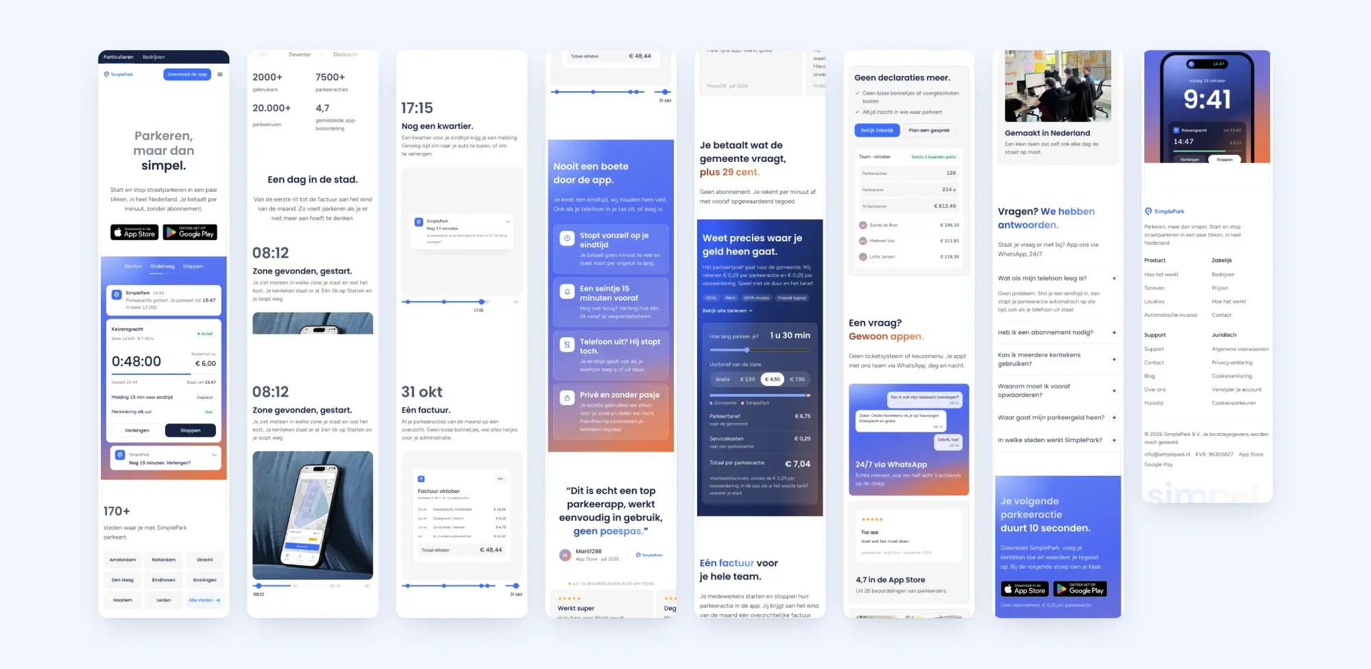
We rebuilt the website. There is less on screen at once, so there is room for what matters. You see the price straight away. In "A day in the city" we walk with you from the first drive to the invoice at the end of the month. And you see where SimplePark comes from: a small team from the Netherlands that hits the street every day too.
What doesn't change
Nothing changes about how you park. You start in a few taps, you see the zone and the rate before you begin, and we stop your parking action on time, even when your phone is off. You pay the municipality's rate, plus € 0.29 per parking action and € 0.29 per top-up. No subscription.
Have a look around the new site. Like something, or not at all? Send us a message. We'd love to hear it.